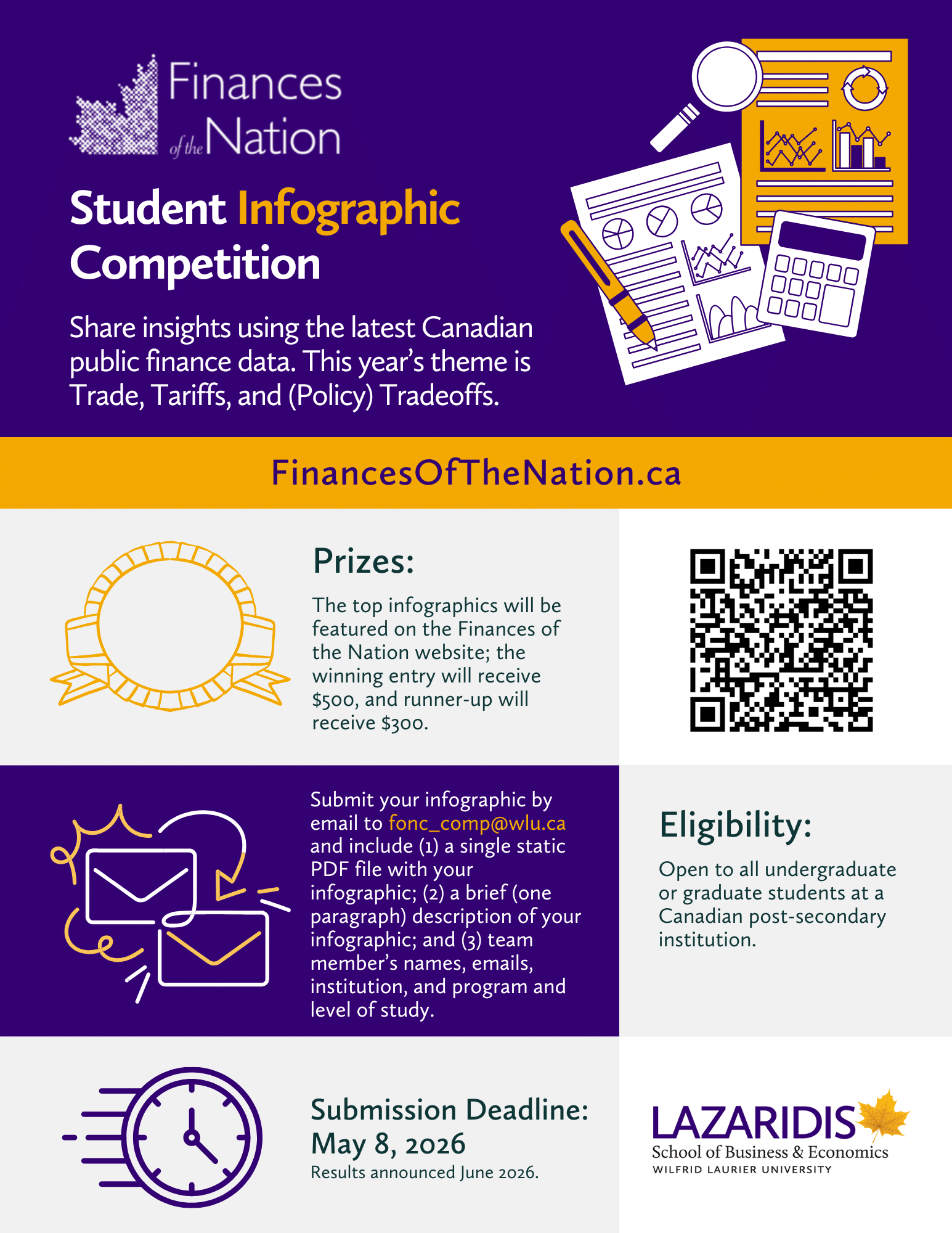

Explore the latest public finance and economic data and share your insights through the Finances of the Nation Student Infographic Competition! The theme for this year’s infographic competition is: Trade, Tariffs, and (Policy) Tradeoffs.
Infographics are a clean, creative, and intuitive way to communicate data. The process of designing them can enhance your understanding of information and improve your skills at data visualization. They can reveal key patterns quickly, and are increasingly used by businesses, academics, governments, statistical agencies, and more!
While we encourage submissions that use data from Finances of the Nation or related sources to explore policy problems and solutions at the federal, provincial or local government level related to this year’s theme, all submissions are welcome.
Key Dates
Deadline for submissions: May 8, 2026
Results announced: June 2026
Prizes
The top infographics may be featured on the Finances of the Nation website, including a brief article discussing the key insight. Check out last year’s winning submission, from Hannah Tsui and Matthew Tang of Corpus Cristi College.
The winning entry will receive $500. The runner-up will receive $300.
We gratefully acknowledge financial support provided by the Lazaridis School of Business and Economics at Wilfrid Laurier University.
Eligibility
The competition is open to any undergraduate or graduate student at a Canadian post-secondary institution. Submissions may be by an individual or by teams of up to 3 students submitting a single infographic. Only one infographic submission is permitted.
Submissions may be produced in any software package, though only static PDF files will be accepted. All data sources and methods must be appropriately cited.
Example Questions
Given the events of this year, there is no shortage of possible questions to explore in the infographic. Examples include:
- How exposed is each province to U.S. trade disruptions? (e.g., choropleth map by U.S.-export share)
- What does Canada collect in tariff revenues—and from which products? (e.g., treemap of tariff revenue by product)
- If Canada removed tariffs on a key consumer product, who gains and what’s the fiscal cost? (e.g., paired bar charts for revenue loss and price change)
- Which Canadian industries are most tied to U.S. supply chains—and where are they concentrated? (e.g., network diagram plus provincial employment bars)
- How do tariffs raise final consumer prices through supply chains? (e.g., Sankey diagram showing cost pass-through)
Submission Process
To submit your infographic for consideration, email the following to fonc_comp@wlu.ca:
- A single PDF file with your infographic;
- A brief (one paragraph) description of your infographic; and,
- Team members’ names, emails, institution, and program and level of study.
Evaluation
A panel of Canadian economists will evaluate submissions based on analytical rigour, design quality and clarity, and originality. Specifically:
- Economic Content (50%)
- Title
- Concise content
- Clear message
- Significance of insight
- Sources and notes
- Display (50%)
- Clear and intuitive presentation
- Graphics and data elements are appropriate and informative
- Design is visually appealing